When it comes to planning meals, I often open up Pinterest in late afternoon to look for a quick meal to put together (granted I have the needed ingredients on hand). Sometimes my lack of planning leads to Kris and I eating spaghetti more than once a week or being tempted to eat out. Neither of those options are budget-friendly or butt-friendly. And I personally like to be friendly to both my budget and my butt. Recently, I’ve been trying to be more proactive with meal planning and I have come up with a project that will keep me motivated: a dry-erase menu board.
I came up with this idea after I made something similar for Kris for Valentine’s Day; I made an “I love you because…” board for me to remind him daily of all the different ways I love and appreciate him. I created it by purchasing a picture frame and some cute scrapbook paper from the craft store and writing “I love you because” on the paper and placing the paper behind the glass and using a dry erase marker to write on the glass. It was inexpensive but something I could customize and has given me the ability to show Kris that I love him everyday!
You could create a dry-erase board for just about anything: reminders, calendars, to-do lists… etc.! The best part is finding a cute frame and paper to match the decor on your house. If you are interested in learning how I created my dry-erase menu board, I have included the steps to do it!
Materials:
- Picture frame
- Decorative paper
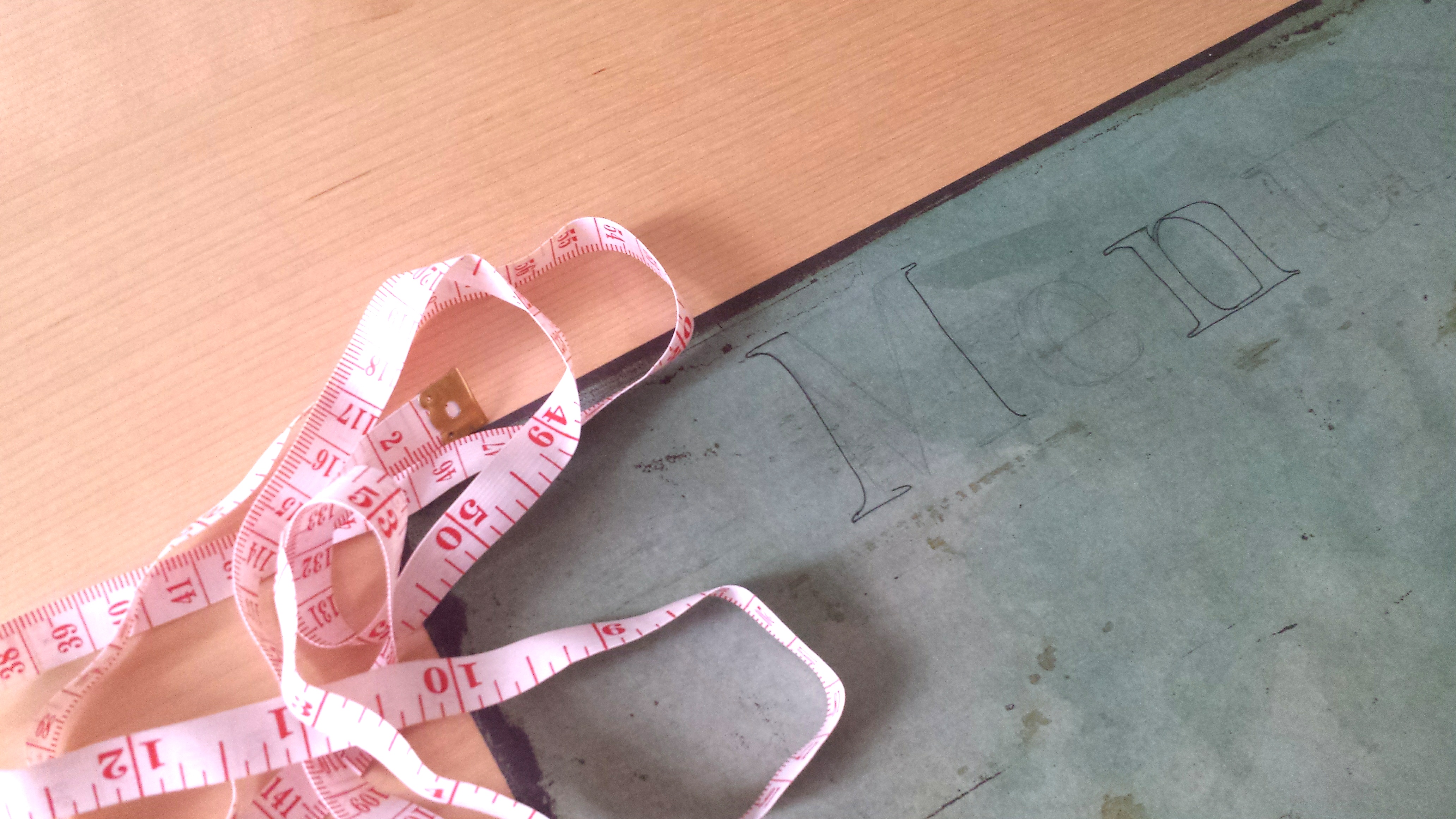
- Ruler
- Pencil
- Sharpie
- Fine tip marker
- Dry-erase marker

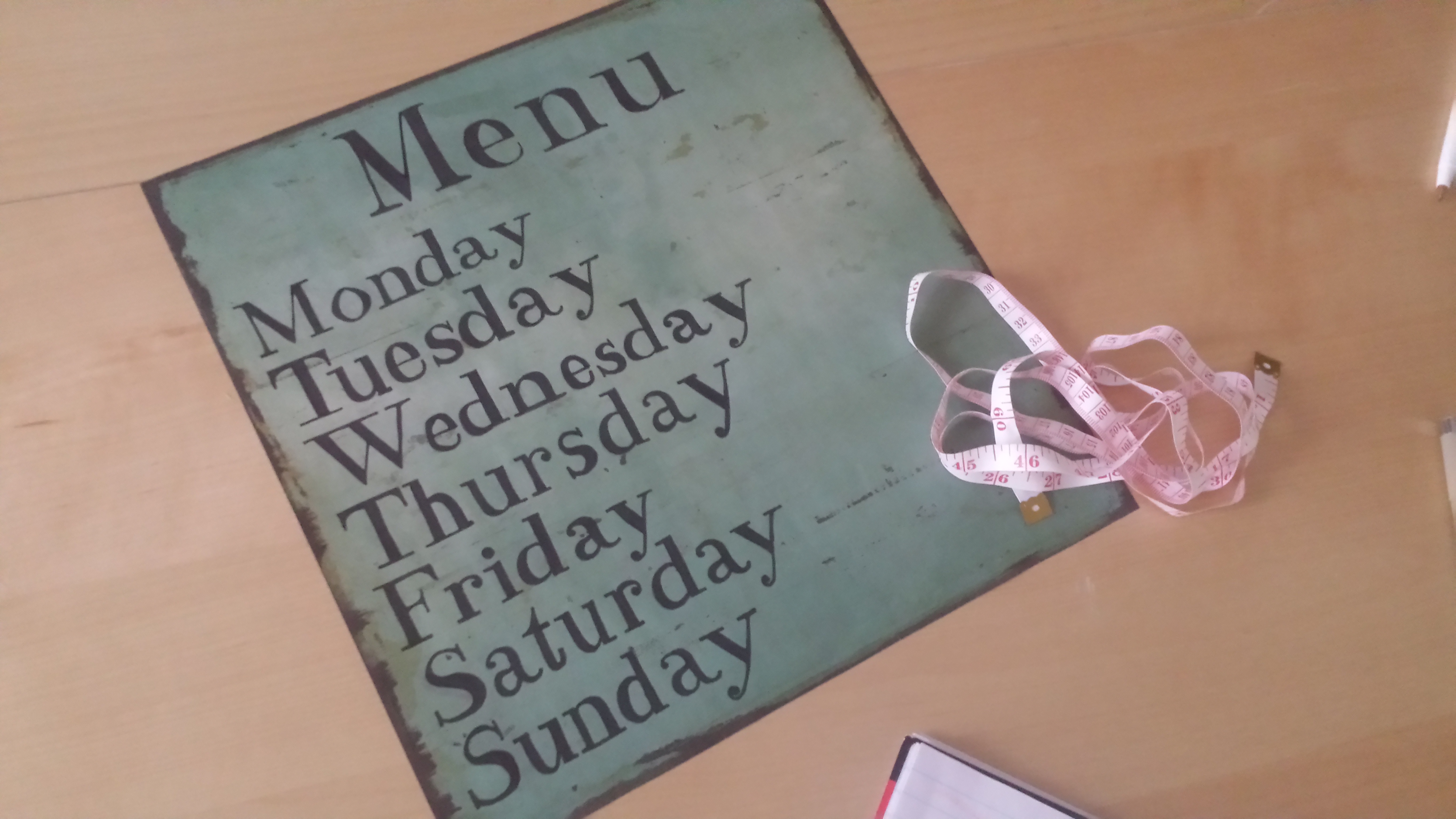
I chose a 12×12 picture frame in order for the paper to fit. Plus, I liked that it was a square. I chose this packet of paper because of the wide variety of options. The paper I choose from this packet has a distressed wooden look and it was dark around the edges, which matched the black frame.
After you gather your materials, the next step is to choose a font. I simply used Microsoft Word and typed out the days of the week in different fonts. I decided upon Modern No. 20 because it seemed to be fairly easy to learn and I liked how the “n” and the “e” looked.
The next step is measuring the center for the heading on the board. I originally thought I would have “What We Be Eatin’ This Week, Yo” but I settled on a shorter, more comprehensive title: “Menu”. Honestly, whatever you heart desires. Once I decided on the title, I then designed the exact cap height, length and width of the title at the top of the page.

Then, I used a pencil to sketch the word “Menu” at the top as accurately as I could. I had the word “Menu” along with the days of the week typed out in a Word document to use as reference.
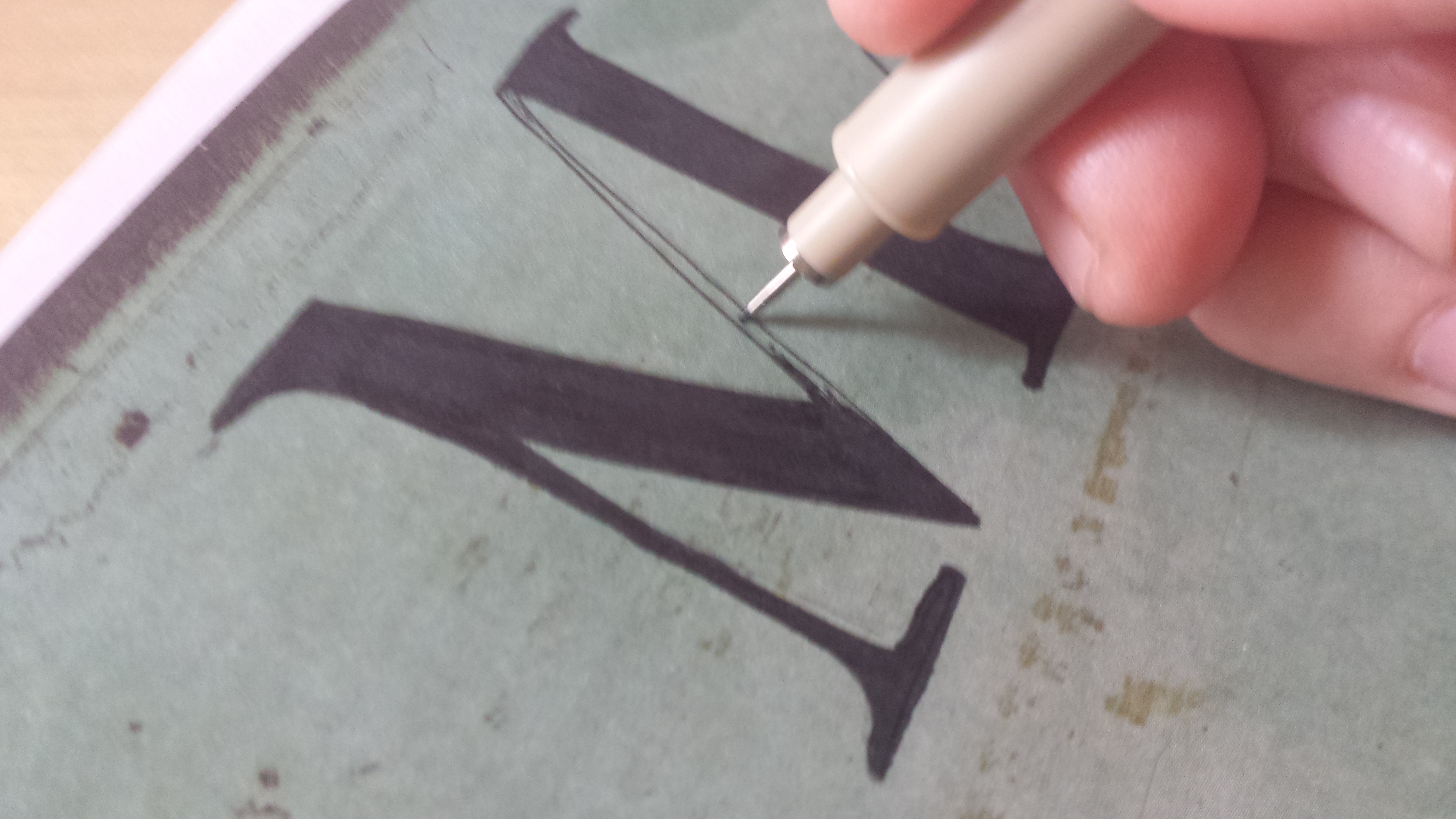
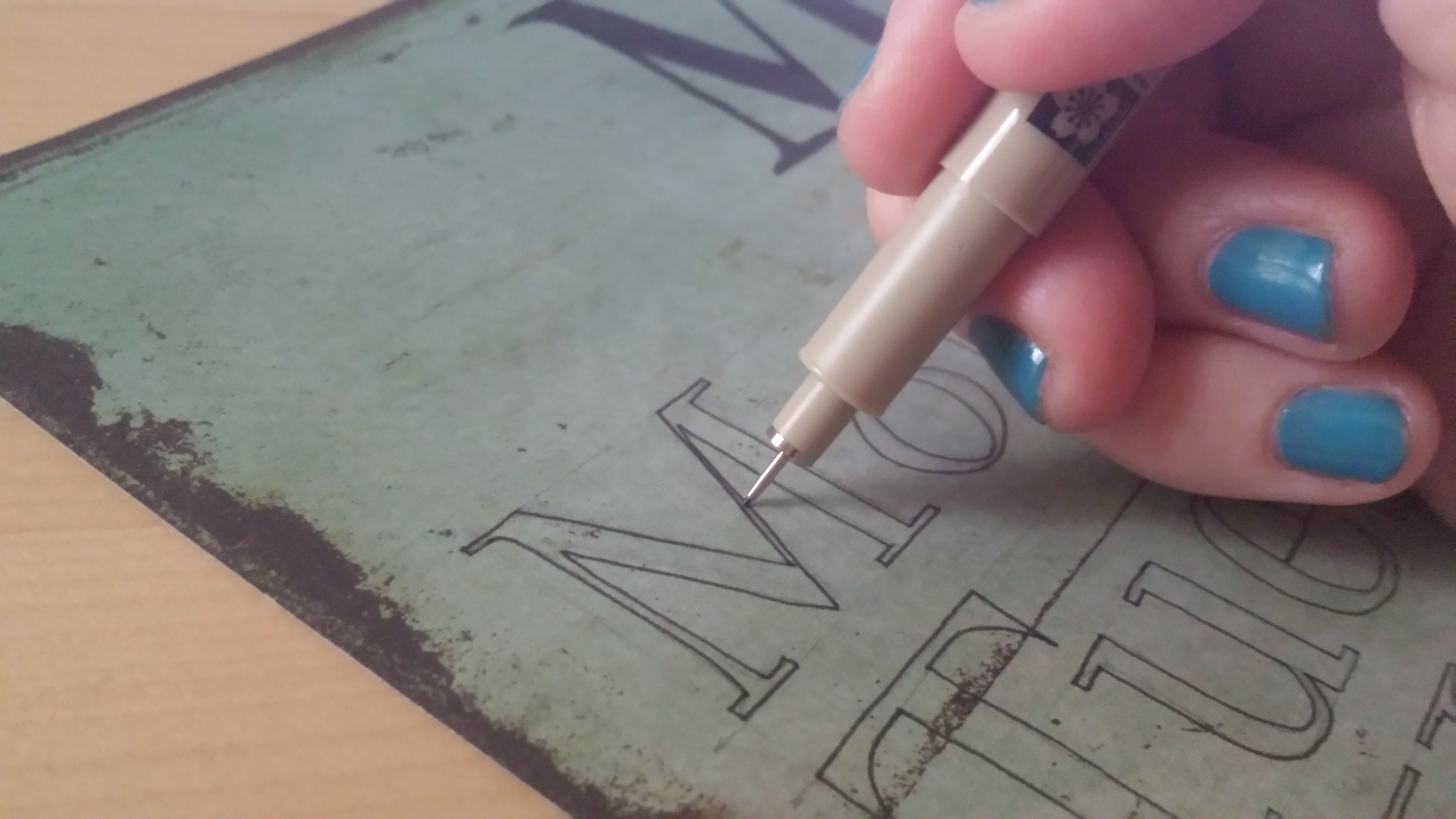
The outline sketch of the words is the most pain-staking aspect of the whole project. I had to sketch – erase – sketch – erase several times. I chose to place the heading about 1/2 inch form the top, the cap height of the “M” is about 1 1/2 inches and the total length of the word is about 5 1/2 inches. Once I finalized the heading, I outlined the word with a fine tip marker. Some of the parts of the letters in this font are very thin, so I used the Sharpie to fill in the bold portions of the letters and then use the fine tip marker to fill in the small lines.

The next step involved a lot of math. And calculating. T’wasn’t fun. I had to figure out the cap height of the seven days of the week and how they would fit on the remaining space of the paper. I determined that about a centimeter below “Menu” was where “Monday” would be placed, and a centimeter of space between each of the days of the week following. Then, I measured the x-height of all of the lower case letters and began to sketch them onto the paper in a similar fashion as “Menu”. Trust me when I say this: this part of the project took about 3 hours. I like congruency and precision in every letter and every word so I was very careful to emulate the anatomy of the font as best as I could.

The next step I used the fine tip marker to make sure the arms and serifs of the letters were level and congruent.

Then I proceeded to outline the rest of the letters with the fine tip marker.
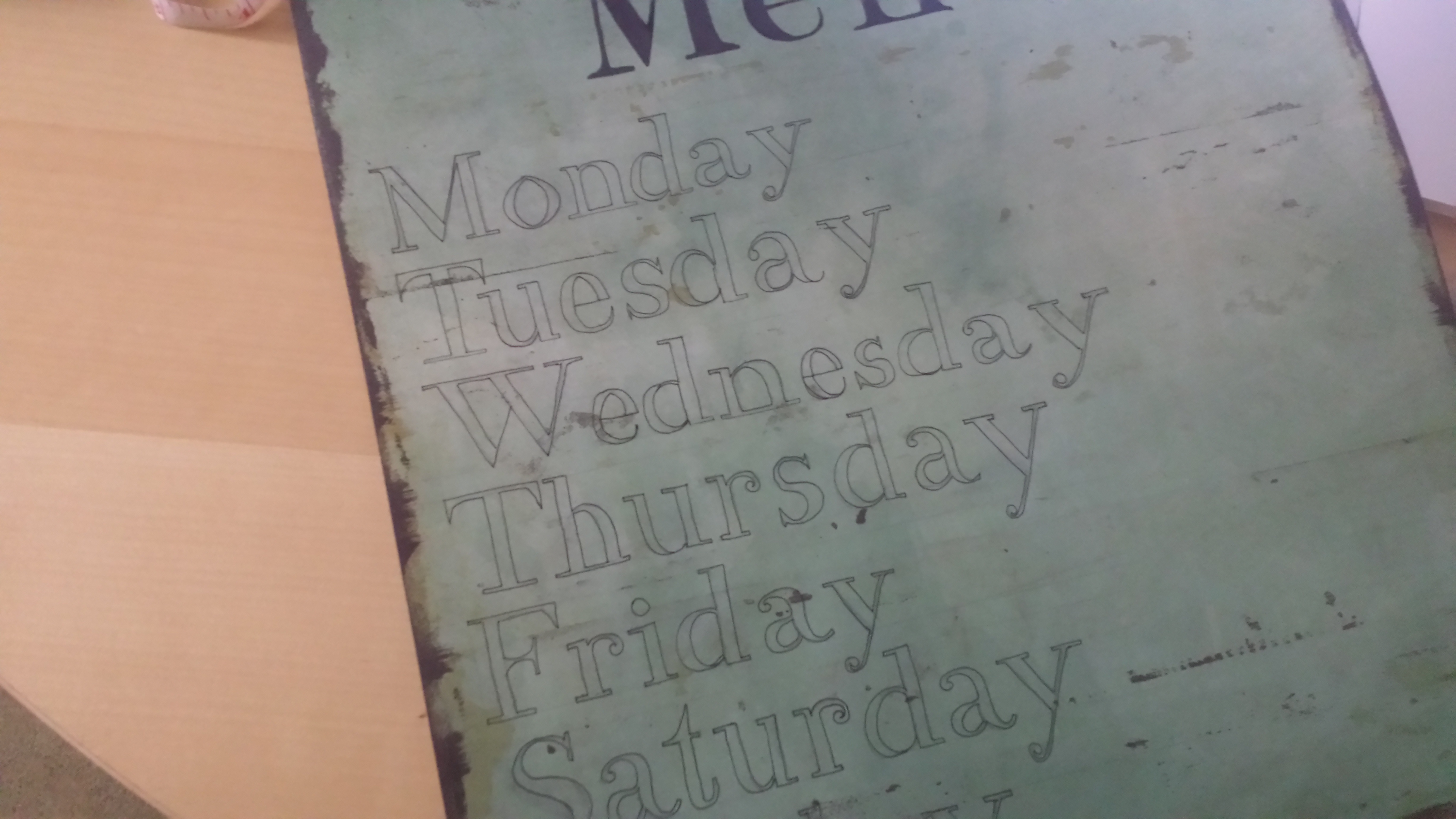
Next, I filled in the letters just as I did with “Menu”. This is the most relaxing part of the project. Seriously, put on some jazz with a cup of coffee (or tea) and just take your time coloring in the letters. To me, it was like sitting in a bubble bath.

When I finished it looked like this:
I also purchased a cheap easel to place the picture frame on so I can place it on my kitchen counter. You could also put in on the wall next to other artwork in your kitchen. The final result is puppy-approved:
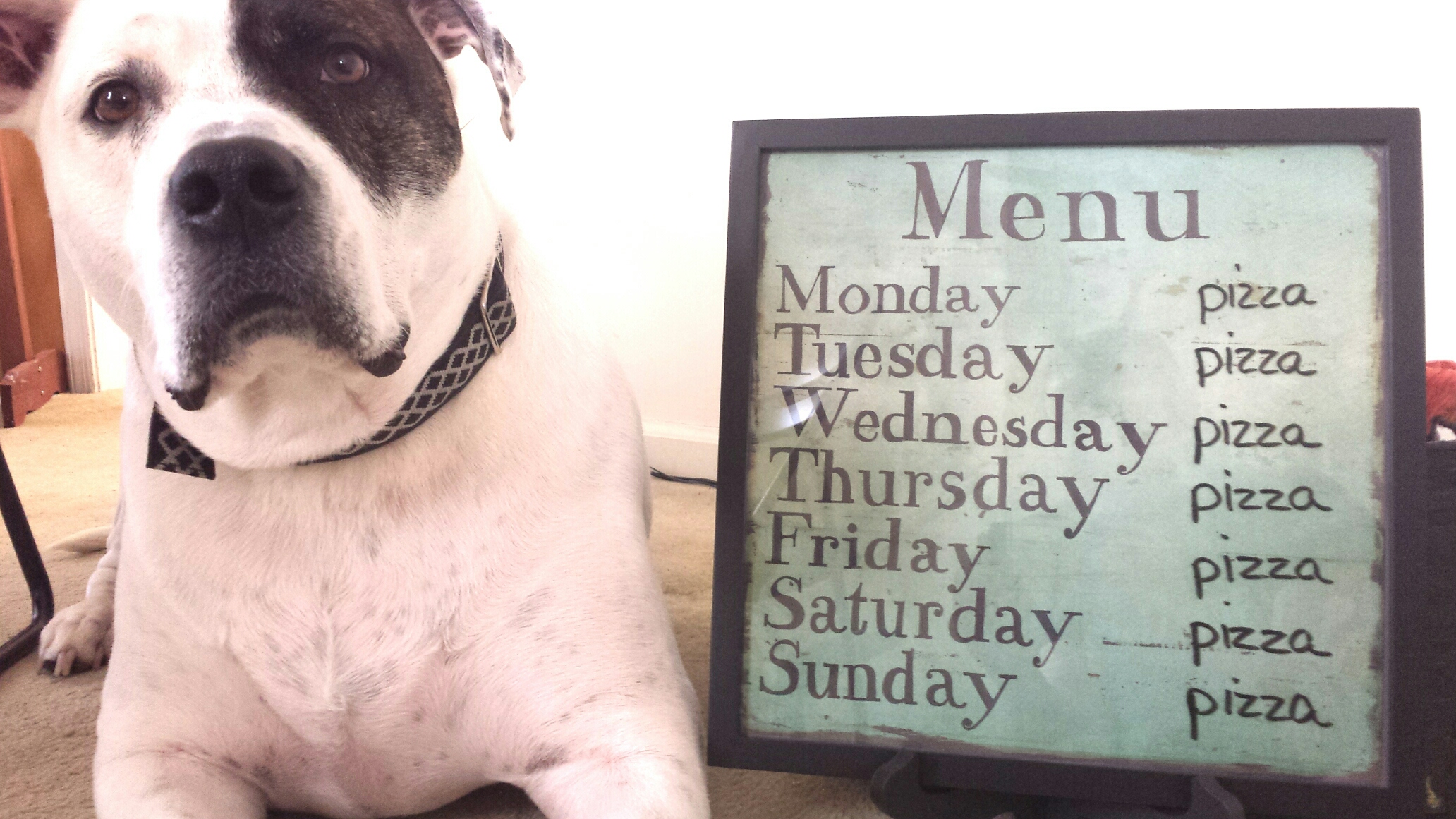
This, of course, is the menu board of my dreams. Pizza every night for dinner? Unfortunately not. But I will certainly be sharing some of my favorite go-to recipes that I make often on this blog among other topics. Thanks for reading and happy DIYing!

Lol. Butt-friendly….
Menu looks cute!
LikeLike